library(tidyverse)
theme_set(theme_minimal())
options(scipen = 1, digits = 3)57 Homework: The Impact of Model Choice
$$ \newcommand{X}{} \newcommand{Y}{}
$$
This homework uses the same simulation framework and estimator functions from the previous homework on adjusted comparisons. Make sure you have that setup code loaded before continuing.
m = 1000
set.seed(1)

x = sample(c(20,30,40,50), m, replace=TRUE)
y = function(w) { (2 + 10*((x-20)/30 + w*sqrt((x-20)/30))) * runif(m, min=0, max=2) }

po.pop = data.frame(x=x, y0=y(0), y1=y(1))

n = 200
J = sample(1:m, n, replace=FALSE)
po.sam = po.pop[J,]

pi = function(x) { 1/(1+exp(-(x-30)/8 )) }
W = rbinom(n, 1, pi(po.sam$x))
sam = data.frame(w=W, x=po.sam$x, y=ifelse(W==1, po.sam$y1, po.sam$y0))

# Functions from HW3
constant.weights = function(sam) { rep(1, nrow(sam)) }
estimate.att = function(sam, formula, gamma=constant.weights) {
  model = lm(formula, weights=gamma, data=sam |> mutate(gamma=gamma(sam)))
  muhat.0X = predict(model, newdata=sam |> mutate(w=0))
  muhat.1X = predict(model, newdata=sam |> mutate(w=1))
  mean((muhat.1X - muhat.0X)[sam$w==1])
}
att.weights = function(sam) {
  ifelse(sam$w==1, 1, pi(sam$x)/(1-pi(sam$x)))
}
sample.and.randomize = function(po.pop, n, pi, replications=1000) {
  1:replications |> map(function(.) {
    J = sample(1:nrow(po.pop), n, replace=FALSE)
    po.sam = po.pop[J,]
    W = rbinom(n, 1, pi(po.sam$x))
    data.frame(w=W, x=po.sam$x, y=ifelse(W==1, po.sam$y1, po.sam$y0))
  })
}
sampling.distribution = function(samples, estimators) {
  samples |> map(function(sam) {
    estimators |> map(function(estimator) {
      data.frame(value=estimator(sam))
    }) |> bind_rows(.id='estimator')
  }) |> bind_rows(.id='sample')
}
plot.sampling.distribution = function(sampling.dist, target) {
  sampling.dist |>
    ggplot() +
      geom_histogram(aes(x=value, y=after_stat(density), fill=factor(estimator)),
        bins=50, alpha=.2, color='gray', linewidth=.05, position='identity') +
      geom_vline(xintercept=target, color='green', linewidth=2, alpha=.5) +
      stat_summary(aes(x=0, y=value, color=factor(estimator)),
        geom='vline', fun.data=\(y)data.frame(xintercept=mean(y)),
        alpha=.9) +
      scale_fill_manual(values=c('purple', 'orange')) +
      scale_color_manual(values=c('purple', 'orange')) +
      guides(color='none', fill='none')
}
lsq.plot = function(sam, formula, gammas, dot.size=NULL, dot.size.scale=2) {
  diamond.shape = 23; square.shape = 22; triangle.shape = 24
  jitter = position_jitter(width=2, height=0, seed=0)
  predictions = gammas |> map(function(gamma) {
    model = lm(formula, weights=gamma, data=sam |> mutate(gamma=gamma(sam)))
    sam |> mutate(muhat = predict(model, newdata=sam))
  }) |> bind_rows(.id='weights')
  sam$dot.size = if(is.null(dot.size)) { 1 } else {
    sum.normalize = function(x) x/mean(x)
    dot.sizes = dot.size(sam)
    dot.sizes[sam$w==1] = sum.normalize(dot.sizes[sam$w==1])
    dot.sizes[sam$w==0] = sum.normalize(dot.sizes[sam$w==0])
    dot.sizes
  }
  sam |> ggplot() +
    geom_point(aes(x=x, y=y, color=factor(w), size=dot.size.scale*I(dot.size)), alpha=.5, position=jitter) +
    geom_point(aes(x=x, y=muhat, fill=factor(w), shape=factor(weights)), alpha=.5, color='black', data=predictions) +
    geom_line(aes(x=x, y=muhat, color=factor(w), linetype=factor(weights)), linewidth=.5, data=predictions) +
    scale_shape_manual(values=c(diamond.shape, square.shape, triangle.shape)) +
    scale_linetype_manual(values=c('solid', 'dashed', 'dotted')) +
    guides(color='none', fill='none', shape='none', linetype='none', size='none')
}

samples = po.pop |> sample.and.randomize(n, pi)
The Impact of Model Choice
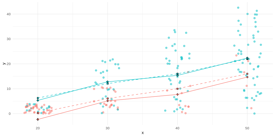
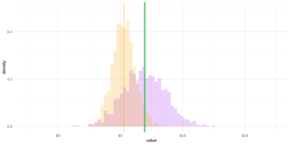
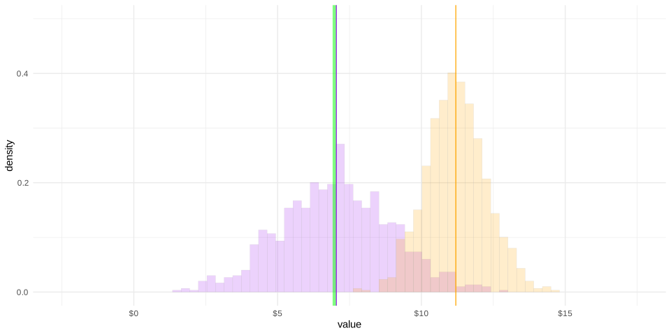
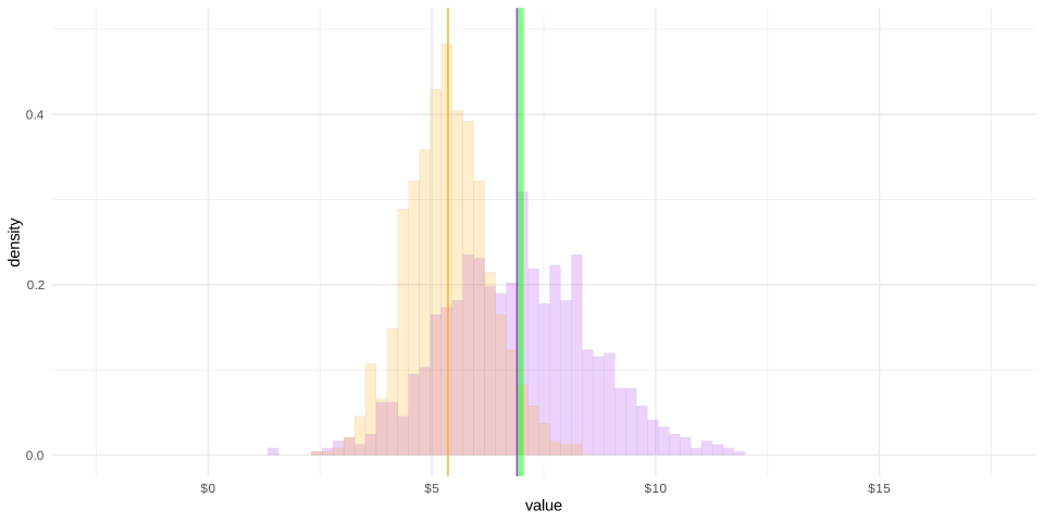
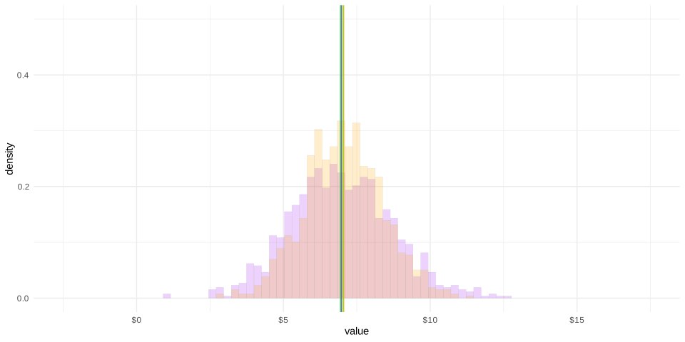
Now let’s think briefly about what happens when we use different models. Below, I’ve tried out four. For each, I’ve drawn two plots below.
- The least squares and inverse probability weighted least squares predictors on top of the sample they’re fit to. Squares show the unweighted least squares predictions; diamonds show the inverse probability weighted least squares predictions.
- The sampling distributions of the ATT estimators using least squares and inverse probability weighted least squares. The unweighted version is in orange; the inverse probability weighted one is in purple.
Let’s use these to do an exercise on visualizing and communicating about bias and coverage.
formula = y~w
sam |> lsq.plot(formula, gammas) 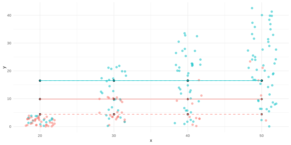
formula = y~w+x
sam |> lsq.plot(formula, gammas) 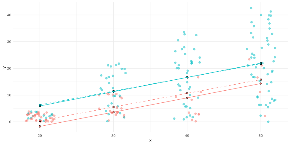
formula = y~w*x
sam |> lsq.plot(formula, gammas) 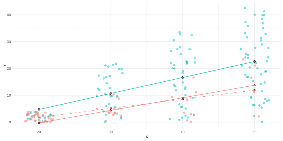
formula = y~w+factor(x)
sam |> lsq.plot(formula, gammas)