47 Signal Processing
Signal Processing: When Noise Isn’t Random
We’ve been thinking of noise as random: sampling variation, measurement error, individual differences. But the math we’ve been doing—least squares, model selection, bias-variance decomposition—doesn’t actually require the noise to be random. Here we’ll see it in action in a context where “noise” is something entirely deterministic: the error you get when you approximate a signal with a finite Fourier series.
Sampling
Sometimes your \(x\)-coordinates are evenly spaced along a line.
- Each \(X_i\) could be time into a digital audio track.
- \(Y_i\) would be the height of the audio wave at that time.
- A CD has \(44,100\) evenly-spaced observations per second.
In signal processing, we call observing a curve at a finite set of points sampling. If you’ve heard about the sampling rate of a CD or audio file, that describes the number of observations in a given time interval. Usually when we talk about sampling in this context, our observations are uniformly spaced. The sampling rate of 44.1kHz, used for CDs, means recording one observation every \(1/44,100 \approx 2.3 \cdot 10^{-5}\) seconds.
Sometimes, we need to know the value of the curve at other points. For example, if you pull an audio track from a DVD and put it on a CD, you’d need to convert it from 48kHz to 44.1kHz. That is, you’d have observed a curve every \(2.08 \cdot 10^{-5}\) seconds and need to know its value every \(2.3 \cdot 10^{-5}\) seconds. Fundamentally, you’d need to guess the value of the curve at places where you did not observe it. We call this interpolation. It’s one of the uses of regression modeling.
The Curves
We’ll work with very stylized fake data. We’ll look at data centered on a few curves \(\mu\) on \([-1,1]\).
- A step at zero, \[ \mu(x) = 1(x \ge 0) \ \quad \text{where} \quad 1(x \ge c) = \begin{cases} 1 & \text{for} \ x \ge c \\ 0 & \text{for} \ x < c \end{cases}. \]
- A line, \[ \mu(x)=x. \]
- A step into a line, \[ \mu(x) = x 1(x \ge 0). \]
- A sine, \[ \mu(x)=\sin(\pi x). \]
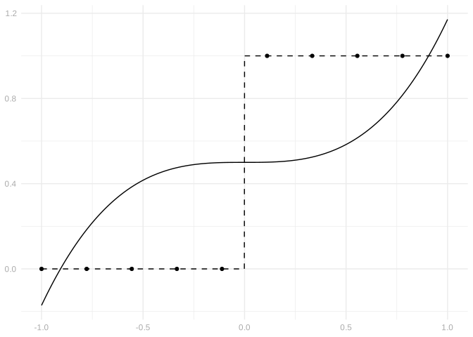
Let’s start by sampling our curves. At uniformly spaced points \(X_i \in [-1,1]\), we’ll observe \(Y_i=\mu(X_i)\).
Interpolation
The difference between interpolation and typical uses of regression modeling is that you put a lot of trust in the observations that you do have — you want the curve you fit to go through every one of them. To do this, you’ll typically need to use a linear model of dimension (i.e. number of basis functions) equal to the number of observations you have. This is just basic linear algebra: if you want to be able to solve 10 linear equations, generally you’ll need 10 variables.
Let’s give that a shot. You’ve got a couple obvious options for getting a high dimensional model.
- Using a high order polynomial. 9th order polynomials are 10-dimensional.
- Using a piecewise-constant curve with 10 pieces.
For the four choices of \(\mu\) above, try using a few 10-dimensional models to interpolate the points \(X_i,Y_i=\mu(X_i)\). Plot your fitted curves on top of the data as in the example above.
For each curve \(\mu\) and each model you fit in the previous part, calculate both of these errors:
The maximal absolute error \(\max_{x \in [-1,1]} \lvert\hat\mu(x) - \mu(x)\rvert\).
The integrated squared error \(\frac{1}{2}\int_{-1}^1 \{ \hat \mu(x) - \mu(x) \}^2 dx\).
Report which model fits each curve best and worst by both standards. Referring to your plots, describe why these models do and don’t fit.
Compression via Fourier Series
Sometimes we don’t observe \(\mu(X_i)\) exactly. For example, if the curve \(\mu(x)\) that we’re interested in is an audio signal, what we observe might be an MP3 file or something similar, which uses an approximation to the original signal to save disk space on your phone, computer, etc. That means that what we’re observing is close to, but not exactly, \(\mu(X_i)\). We observe \(Y_i=\mu(X_i)+\varepsilon_i\) where \(\varepsilon_i\) is the difference between the compressed signal and the original at \(x=X_i\).
To compress our signals \(\mu\), I’m going to use one of the simplest compression schemes out there: Fourier series approximation. You don’t need to know to do this, but you can think of \(K\) in compressed.curve below as a fidelity parameter. The larger it is, the closer we’ll be to the original signal \(\mu\). Try changing it in the code below and see what happens to our compressed curves.
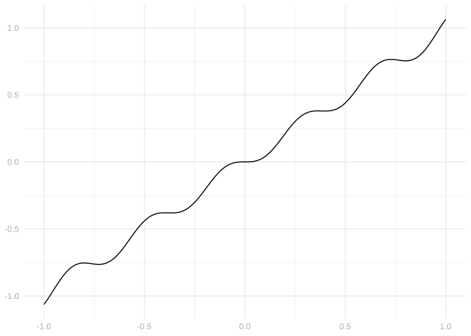
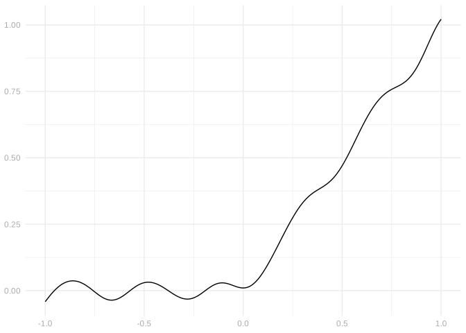
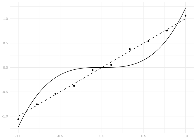
If we sample our compressed curves, this is what we get.
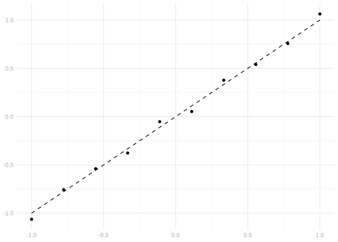
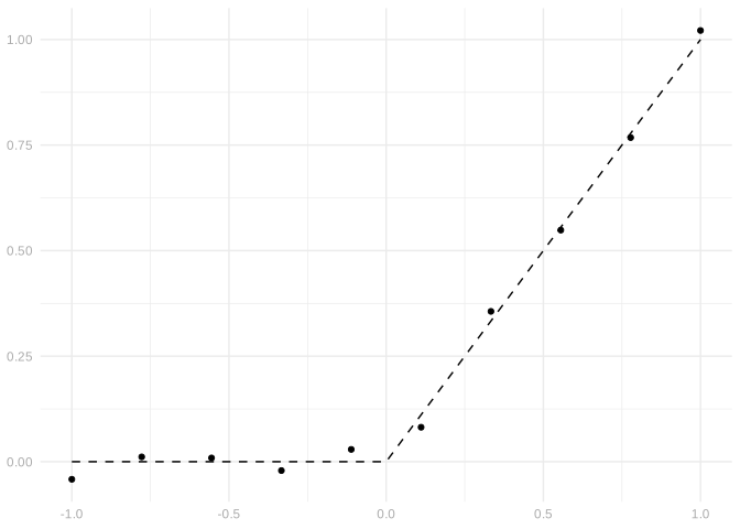
For the two choices of \(\mu\) that we’ve compressed, try fitting a few models to samples from the compressed model. Plot your fitted curves on top of the data as before. Then, for each curve \(\mu\) and each model you fit, calculate maximal absolute error and integrated squared error. What you’re comparing to here should be \(\mu\), not the compressed version, as that’s what you want to know about. Report which model fits each curve best and worst. Referring to your plots, describe why these models do and don’t fit.
Random Errors vs. Compression Errors
Often, when people talk about regression, they imagine that the errors \(\varepsilon_i\) are random with mean zero. The compression errors we’ve been looking at aren’t, but it’s worth asking whether that’s a good enough approximation. Let’s see what happens if we observe \(Y_i=\mu(X_i)+\varepsilon_i\) where the noise \(\varepsilon_i\) is gaussian with mean zero and standard deviation matching the errors we got from compression: roughly \(.05\) for the line and \(.025\) for the step-line.
$line
[1] 0.04720854

$stepline
[1] 0.02403561
Here’s what our observations look like.
[[1]]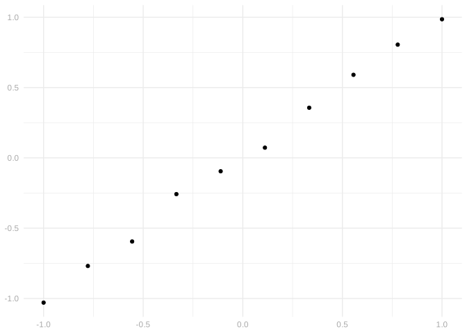
[[2]]
Repeat the last exercise using these random errors instead of compression errors. Don’t worry about taking down all the details here. Just say whether what you see in the plots and error measures is similar.
Where Errors Come From
In signal processing, it’s easy to think of where errors come from.
- Compression, like recovering a signal from an MP3.
- Energy leakage in digital photography.
- Quantum fluctuations in low-light photography.
In short, it’s physics stuff. That’s why it’s nice to talk about signal processing.
In social science data, it’s not so easy.
- There’s always going to be variation.
- No two people, schools, etc. are going to be exactly alike.
- But usually some of the variation we see can be explained.
Explaining Variation
\[ Y_i = \underset{\text{trend}}{\mu(X_i, \text{etc}_i)} + \underset{\text{error}}{\varepsilon_i} \]
- In this context, what we mean by errors depends on what we model.
- It’s just variation we aren’t able to explain.
- You can imagine that if you had enough info, there’d be no variation left.
- Like a clean, uncompressed audio signal
- Or a perfectly sharp image
- Or whatever that would be for a school
- But that’s really just an abstraction.
- We won’t get there.
- Often we won’t get close.
- That’s why it’s a pain talking about social science data.
- It’s hard to describe what you want to explain and what you don’t.
- We’ll develop some language later, but it’ll take a while.
Random errors as a model for non-random ones
- We can’t really scale up compression errors to typical sizes.
- But we can do it with random errors.
- And often, random errors will give you the same behavior.
- You can think of random errors as a model for your non-random ones.
Pretending noise is random often leads to the same conclusions you get when you think more faithfully about reality. We saw this happen in the signal processing lab.
Fourier Series as Features
When we have multiple continuous covariates, we tend to base our models on series expansions of functions.
Based on Taylor series we might use the general quadratic model. \[ m_{\beta}(x) = \beta_0 + \beta_1 x_1 + \beta_2 x_2 + \beta_3 x_1^2 + \beta_4 x_2^2 + \beta_5 x_1 x_2. \]
Based on Fourier series we might use something else. \[ m_{\beta}(x) = \beta_0 + \beta_1 \sin(\pi x_1) + \beta_2 \sin(\pi x_2) + \beta_3 \sin(2\pi x_1) + \beta_4 \sin(2\pi x_2) + \beta_5 \sin(\pi (x_1+x_2)) \]
A single continuous covariate can enter polynomially (\(\phi_j(x)=x^j\), think Taylor series): \[ Y_i = \beta_0 + \beta_1 X_{i} + \beta_2 X_{i}^2 + \ldots \]
Or through a cosine wave (\(\phi_j(x)=\cos(j x)\), think Fourier series): \[ Y_i = \beta_0 + \beta_1 \cos(X_{i}) + \beta_2 \cos(2 X_{i}) + \ldots \]
The Complete Fourier Series Code
1D Signal Processing Example: Model Selection
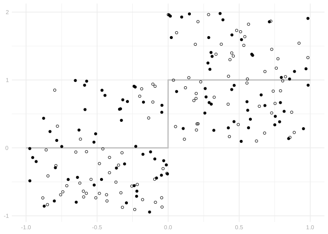
Now let’s work on a more realistic but still fairly stylized example. We’ll work with data in which \(X_i\) is uniformly distributed on \([-1,1]\) and \(Y_i=\mu(X_i) + \varepsilon_i\) where \(\mu(X_i)\) is a step function and \(\varepsilon_i\) is independent of \(X_i\) and also uniformly distributed on \([-1,1]\). That is, \[ Y_i = \mu(X_i) + \varepsilon_i \quad \text{ where } \quad \mu(x) = 1(x \ge 0) = \begin{cases} 1 & \text{for} \ x \ge 0 \\ 0 & \text{for} \ x < 0 \end{cases} \text{ and } X_i \text{ and } \varepsilon_i \text{ are independent with probability density } p(x)=\frac{1(x \in [-1,1])}{2}. \]
We’ll have \(200\) of these observations, and we’ll use \(n=100\) as our training set and \(\tilde n=100\) as our test set.
Model Selection
Let’s start by fitting ten curves \(\hat \mu_1 \ldots \hat \mu_{10}\) on the training set via least squares and calculating their training and test error. We’ll use polynomial models \(\mathcal{M}_1 \ldots \mathcal{M}_{10}\) of orders 1 through 10.
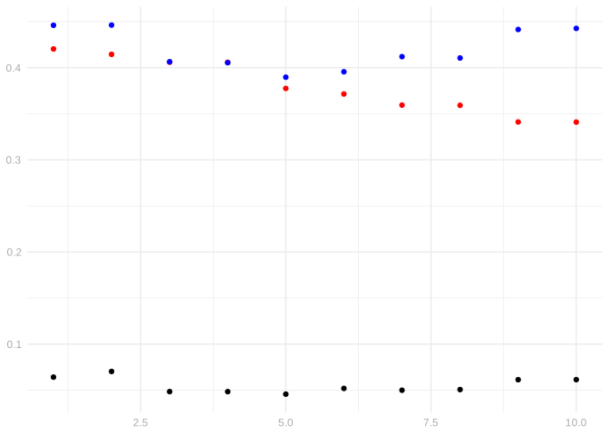
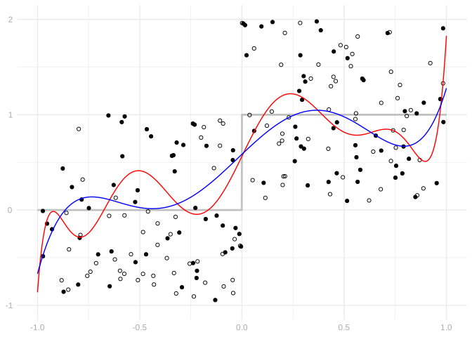
Which do you prefer? Explain why.
Model Aggregation
Now let’s find the best linear combination of these polynomial fits.
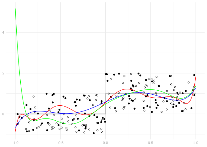
Implement model selection and aggregation using 20 models instead of 10: our 10 polynomial models as well as piecewise-constant curves with 1-10 breaks evenly spaced in the interval \([-1,1]\).
The step function we looked at in the last example is a piecewise-constant curve with one break. Is that what gets selected? Why or why not?
Repeat this exercise twice, first taking \(\mu(x)\) to be the 3rd order polynomial \(x^3\), then a 7th order polynomial of your choice.
The Universality Point
Until we’ve got language for describing what variation in social science data we want to explain and what we don’t, we’ll basically stick to signal processing. It may sound like we’re talking about social science, but we’ll be using fake data. That means we’ll know exactly what the clean signal is and how it’s compressed. Working with well-thought-out fake data is a good way to check your approach. If your approach fails on fake data, why would you trust it on the real stuff?
The Fourier truncation error plays exactly the same role as modeling error in our decomposition from the confidence intervals material. When we fit a model \(\mathcal{M}\) and the true signal isn’t in \(\mathcal{M}\), we get \[ \hat\mu(x) - \mu(x) = \underset{\text{sampling error}}{\{\hat\mu(x) - \tilde\mu(x)\}} + \underset{\text{modeling error}}{\{\tilde\mu(x) - \mu(x)\}}. \] The truncation error is the modeling error term. And our least squares machinery handles it the same way regardless of whether the “noise” \(Y_i - \tilde\mu(X_i)\) is random or deterministic.
This is the universality point: in social science, “noise” is just unexplained variation. It might be individual differences, measurement error, or model misspecification. The least squares framework doesn’t care. The same formulas—orthogonality of residuals, the bias-variance decomposition, the sandwich variance—work regardless of the source.